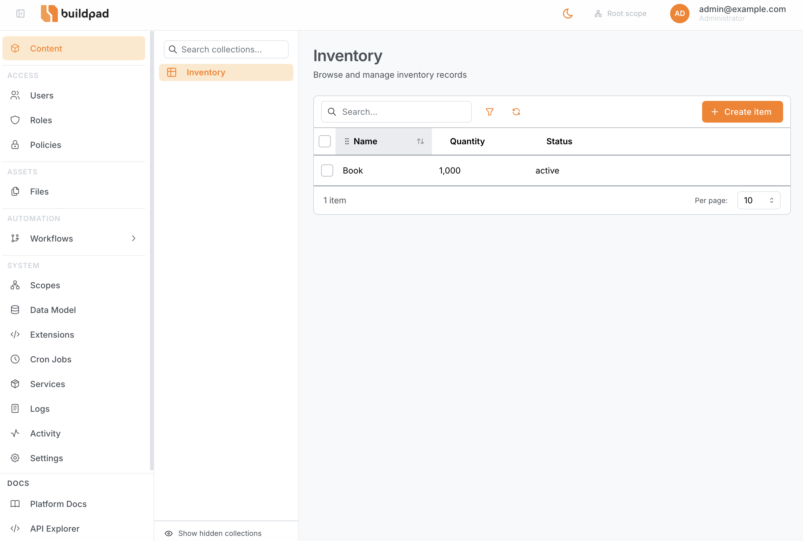
Content Browser
The Content Browser at /content is the primary interface for managing the data inside your collections. It lists every user-defined table in your database and gives you a searchable, filterable, sortable view of each one — plus a dynamic form for creating and editing individual records.
System tables (those whose names begin with daas_) are never shown. Only tables you have created through the Data Model editor appear in the sidebar.
Navigating Collections
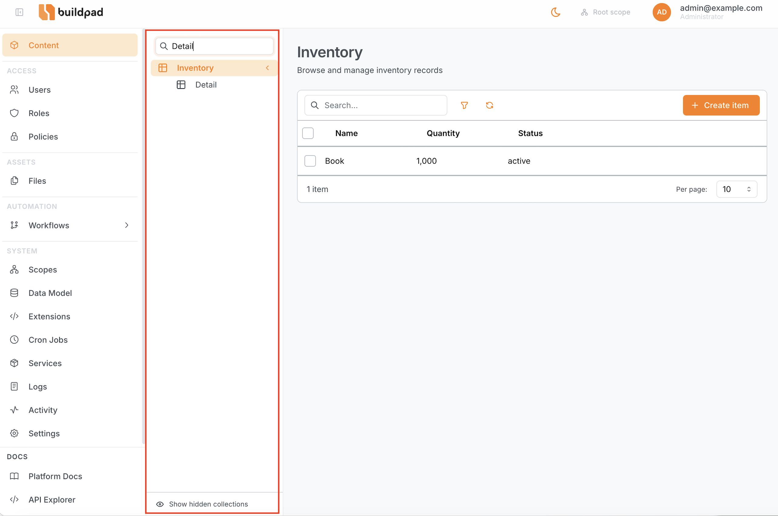
The left sidebar shows all visible collections, organised into groups.
- Expand / collapse groups by clicking the group header.
- Search by typing in the sidebar search box — results filter after three characters.
- Show hidden collections using the toggle at the bottom of the sidebar. Hidden collections are excluded by default.
Each collection entry can display a custom icon and accent colour, configured in the Data Model editor.
Browsing a Collection
Clicking a collection in the sidebar opens its list view — a full data grid showing all accessible items.
Table controls
| Control | How to use |
|---|---|
| Sort | Click any column header to sort ascending; click again for descending. |
| Resize columns | Drag the column divider in the header row. |
| Reorder columns | Drag and drop column headers left or right. |
| Row click | Opens the item detail/edit form. |
Toolbar
| Control | Description |
|---|---|
| Search | Full-text search across all string fields (debounced). |
| Filter | Toggle the filter panel (see Filter Panel). An orange badge shows the number of active filters. |
| Refresh | Reload items without clearing state. |
| Create | Navigate to /content/{collection}/new to open a blank form. Only shown when you have create permission. |
Pagination
Use the page size selector at the bottom of the table to show 10, 25, 50, or 100 items per page.
Bulk actions
Select multiple rows using the checkbox column, then use the bulk-actions bar that appears to delete the selected items. A confirmation dialog appears before any destructive action. The delete action is only available when you have delete permission on the collection.
Filter Panel
Click the Filter button in the toolbar to open the filter panel.
- Add one or more filter rules using the rule builder.
- Rules support all field types and operators (equals, contains, greater than, is null, etc.).
- Active filters are counted and shown as a badge on the Filter button so you can see at a glance that the list is narrowed.
- Filters compose with search — both are applied simultaneously.
For a full reference of available operators and the filter syntax used by the underlying API, see Filter Rules.
Creating & Editing Items
Create mode
Navigate to /content/{collection}/new (or click the Create button) to open a blank form. If your role’s permissions include presets for this collection, those default values are pre-filled automatically.
Edit mode
Click any row in the list to open the item at /content/{collection}/{id}.
Form behaviour
The form tracks changes incrementally. Only the fields you modify are sent in the PATCH request — unchanged fields are never included in the payload. This avoids unintentional overwrites when multiple users are editing the same record.
Internally the form tracks two data states:
| State | Description |
|---|---|
initialFormData | The original item data loaded from the API. |
formData | The current form state (all edits applied). A hasEdits flag is derived by comparing the two. |
When there are unsaved changes the save button activates and a Discard option becomes available in the save menu to reset back to initialFormData.
Save options
The save button includes a Save & Add Another option that saves the current item and immediately opens a fresh blank form for the same collection — useful for bulk data entry.
Delete
An inline Delete button is available in edit mode (when you have delete permission). A confirmation dialog appears before the item is removed.
Breadcrumbs
The page header always shows the full path: Content → Collection name → Item ID so you can navigate back quickly.
Field Interfaces
Each field in a collection has an interface that controls which input component renders in the form. Interfaces are configured per-field in the Data Model editor.
| Interface | Use case |
|---|---|
input | Short text — single-line string input |
input-multiline | Long text — multi-line textarea |
input-rich-text-html | HTML rich-text editor |
select-dropdown | Enum or choice list — picks one option from a fixed set |
boolean | Toggle switch — true / false |
datetime | Date and time picker |
file | File attachment — opens the file picker with upload support |
file-image | Image-specific file picker with inline lightbox preview |
input-hash | Password / bcrypt hash input — value is hashed on save |
select-dropdown-m2o | Many-to-One relationship — dropdown selector linked to another collection |
list-o2m | One-to-Many — inline list of related items from another collection |
list-m2m | Many-to-Many — tag-style multi-select backed by a junction table |
system-token | Static access token generator (API token) |
The interface for each field is set in Data Model → Fields → Edit field → Interface. Changing the interface does not change the underlying column type — it only affects how the field is rendered in the Studio form.
Permissions
The Content Browser enforces your role’s permissions at the UI layer, mirroring the API-level enforcement.
| Scenario | Behaviour |
|---|---|
| Field not in readable list | Hidden entirely — not shown in the list or form. |
| Field not in writable list | Shown but rendered as read-only; cannot be edited. |
No create permission | Create button is hidden; /new route rejects the save. |
No delete permission | Delete button and bulk-delete action are hidden. |
| Permission presets defined | Pre-filled as default values when opening the create form. |
Hiding a field in the UI does not replace API-level security. Always configure field permissions and RLS policies in Roles & Policies — the UI restrictions are a convenience layer on top.